|
Part 9: Making a Fighting Game Sprite
Okay, so we've worked with a tiny 16x16 sprite...Nice and simple for a traditional console style RPG. "But I want to make an action game...something with BIG sprites! You know, like a Capcom fighter!" You may have jumped right to this section and skipped messing with the dinky little sprites because you want to make big cool looking sprites. If that's the case, go back and read about the dinky little sprites. Depsite changing the size of your sprites, the basic principles still apply (especially the parts about how much difference one pixel can make). Okay, now assuming you've done that and you're truly ready to make a sprite that can do a little fighting...
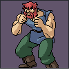
But first, let me point out that this is NOT just for fighting games. I use the term all the time because that's what I'm basing the pose/stance of the tutorial sprite on. These techniques and concepts can apply to all sorts of games...Earthworm Jim probably used the same type of techniques. Remember, learn from everything you can, and adapt it to suit your needs. Now that that's out of the way, let's look at a few examples from Street Fighter Alpha 3 first, to get in the groove:
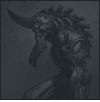
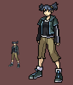
Now THAT is some pixel skill. Each character has their own unique look...Zangief is a huge mass of muscle, while Sakura is practically a tiny little stick figure in comparison. Also notice the difference in widths between the two. This tells us that the sprites each have their own size, with no real restricting bounding box. Sakura is 76x87 while Zangief is 116x111. These measurements are based off only the pixels, however. If Zangief lunged forwards and stretched out horizontally, his sprite would become much longer horizontally and much shorter vertically. Anyway, the bounding boxes aren't important right now...we're focusing on how to MAKE these things. But keep in mine that the general "standard" is a height of about 100 pixels. The width will usually be less, except in the case of a wide character like E.Honda, or someone who's carrying a weapon that sticks out sideways. Anyway, let's stick with 100 pixels.
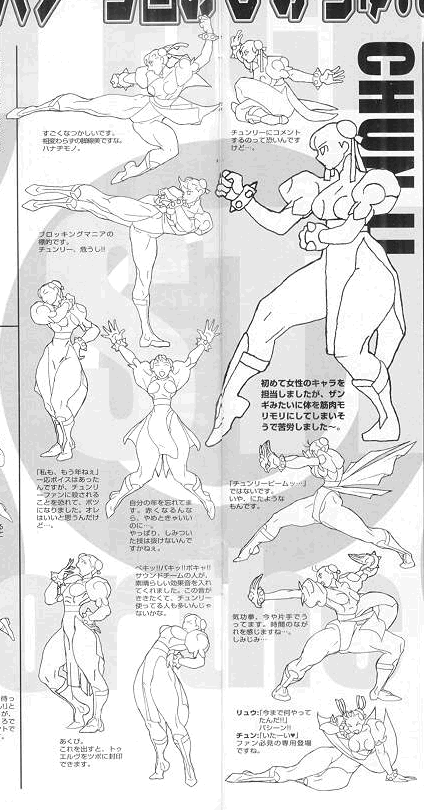
The method Capcom uses is a mystery. They have no tutorials or explanations anywhere on how they make their sprites, which isn't too surprising because they have better things to do than work on tutorials, heh. I, however, do not...So here's what I've figured out from analyzing the sprites and collecting small bits of information from all over the place over the years. Let's look at a bunch of pictures of Chun-Li from Three (Street Fighter 3):
(click image for actual size)
All the frames are drawn out, scanned in, and then retraced pixel by pixel. Capcom may have some sort of program that retraces the sprites for them (leaving just a bit of touch-up work to do), but I have no idea. Since we don't have a program that can do this for us handy, we're going to go pixel by pixel. It's possible that Capcom does this (and just has a huge army of artists chained to their computers), but it's pretty time consuming...and when you look at the number of frames in a game like Three, it's hard to imagine them going through every sprite pixel by pixel manually. But again, I have no idea, so we'll go with what we CAN see. What we can tell from looking at the sprites is that they HAVE to somehow be retracing them...The way we can tell is from the thickness of the lines on the sprites. Each sprite is pixel perfect...A line that defines a muscle is drawn with a one pixel thick line. There aren't "blobs" of pixels (like when you hold down the mouse button and make a curve), and there's no anti-aliasing on the lines (like you get when you draw a character, color it, then shrink it down to sprite size). This is a sign that they go in and manually adjust everything to look perfect, because you can't waste pixels on inaccurate lines when you're working with sprites. Now that I think about it, the Japanese writing underneath the sprites may very well say "Here are instructions on exactly how we make our sprites!" but I can't read Japanese so I have no idea, heh...
The main picture of importance is the large Chun-Li in the upper right. Note the lack of detail on her. When you're making a sprite, you can only have a certain amount of detail that shows up. If you're doing a tiny little 8x8 face, you're NOT going to be able to show the lines for nostrils, so why waste time drawing them in? Note the curved lines on her clothing...when in sprite form, those are one pixel thick yellow lines (details on the costume). The line will have some thickness to it, and if the picture were a portrait of some sort, they'd be given width...but since the sprite will be small, there's no point in drawing the line with width. She also has yellow "trim" around the cloth that hangs down...but that's added when you're doing the pixel work. So the first thing you want to do, is get a simplified style going that you can use.
Straying for a moment, I'd like to explain that there are a lot of different ways of doing sprites. The method you use depends on your skill level and the size of the sprites you're working with. If you're making a 16x16 RPG character, there is NO point in hand drawing him first, scanning him in, then retracing. Just work with pixels. If you have no skill at hand drawing, then there's no point in hand drawing the character first, because you might get better results by just messing with pixels. Two other methods you might want to try, if you don't feel confident in your drawing skills, or you don't have access to a scanner...or simply don't want to go through the trouble of hand drawing every frame and scanning it in (which is honestly a big pain in the butt):
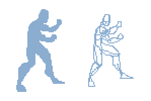 On the left is a silhouette (shadow figure). One of the basic rules of animation is that if your character were a silhouette, the viewer should still be able to tell what they're doing. Now this can't be a rule set in stone when you're working on videogame graphics because in animation if you wanted to show someone messing with their tie, you could do it from any angle...But on a videogame sprite, you have specific angles to work with and have to adapt. The general principle, however, is something to keep in mind. It's also the basis for planning out your sprite with a silhouette. When you're doing an animation, you may want to do each frame this way so you can be sure the character reads nicely to the viewer's eyes. The silhouette is just a very rough, quick figure. It's used simply to get a general feel for what the character's pose, height, body structure, etc. Will be.
On the right side is a scribble man (heh, technical term there). I use these sometimes because they're a little more clear than the silhouette, and a bit faster to make. It's basically just scribbling out the general form of the sprite so you know what limbs go where and everything. It serves the same purpose as the silhouette, but allows you to get a little more detail in showing which arm is is front and where muscles would go and such. It's not BETTER than the silhouette, of course...It's just another method you might want to try. The drawback is that since this is basically what you do when you're hand drawing (planning out the pose first), you need to be able to handle the mouse a little better, because you're drawing out specific details. With the silhouette method you can start with a blob and swipe away pixels or smudge some in. Anyway, try some different things and see what works well for you.
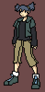
For this tutorial, I'm going to use Photoshop 4.0 but I'm going to try not to get too tech-heavy. When I'm talking about anti-aliasing and other things, they're generally universal in paint programs...In the program you're using, you'll probably have to search to find the same things, but they'll probably be there. An important thing to note, however, is that Photoshop is generally NOT good for doing sprites. The reason is that a lot of games use palettes for everything, and Photoshop pretty much bites for specifically altering and organizing the palette. This is purely because Photoshop isn't really built for this purpose...first and foremost it's supposed to be used for modifying photos and making illustrations and that kind of thing. Palette manipulation doesn't really play into that, so it's pretty crummy for doing sprites in. If the game you're making has no palette (most PC games are like this whereas consoles (Game Boy Advance, Game Boy, SuperNES, Genesis, etc.) use palettes) and you don't have to worry about how many colors you're using and which spaces on the palette you need to use, then Photoshop is fine for doing sprites. I like to use Photoshop for practising sprites because I don't have to worry about setting up each color on the palette and everything that I would if I were using a palette-based program. Anyway, the sprite I'm going to do for this tutorial is going to be done in Photoshop because a lot of people have it and we don't have to worry about palette restrictions or anything which will make explaining a lot easier. I'm also going to use a hand drawn picture to start with, because that's what Capcom does and it's a nice method:
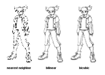
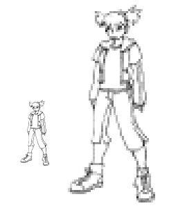
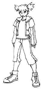 I drew the character by hand (using about 1/4 of a normal sheet of 8.5x11" paper...since she's not going to be super detailed and she's going to be shrunk down extremely small, there's no sense in working with a HUGE image), inked her, then scanned her in (300dpi, Black and White (lineart) mode...before you resize you'll have to change it to RGB or Grayscale mode (go with RGB because you'll be adding color later and have to do that anyway) so the anti-aliasing will work). That gave me a relatively large picture, so I just shrunk it down to show here. There are problems with it, like her front foot is twisted weird and her other leg's thigh is a little thin...but those things can be corrected in the pixel stage so they're not a big deal. Note that I went and drew double outlines for the shirt linings and on the jacket. I did that by accident and...no wait, I mean I did that to show you what problems that will cause. Yeah, that's it. Okay, so we can't use the picture this big, so let's shrink it down to around 100 pixels. Because she's in a white box, she'll be a little smaller than 100 pixels because I want a few pixels of buffer space around her so that if I decide later that she's too short or her hair needs to go higher, I'll have enough room to do so. Oh, and when shrinking, I used bilinear resampling which means...okay, I don't know what it means. When you resize an image in Photoshop, look at the bottom where you can set the style of anti-aliasing. The three types of anti-aliasing do different things:
(click image for actual size)
"Nearest Neighbor" does NO anti-aliasing whatsoever. This is extremely useful when you want to resize your sprite after you're done to make a version 4x bigger to show people so they don't have to put their nose up against the screen to see it. You can also shrink with it so you can blow up a sprite to show someone, get some feedback, then shrink it down again and mess with it once more without having your pixels altered at all. I use this a LOT for making this tutorial, heh...
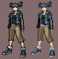
"Bilinear" and "Bicubic" do almost the same thing...Bicubic seems to do more anti-aliasing. The picture I started with was relatively small to begin with, so it doesn't make a huge difference with this sprite, but if you're shrinking down from a pic that's like 800 pixels tall (right after you scan it in, you might get a pic that size), it'll be more noticable. The problem with using bicubic is that you can get too MUCH anti-aliasing. Compare the shin on her right leg (the one in the background). On the bicubic one, it's much more blurry than on the bilinear one. The same goes for the lines on the arm and the facial details. This can be annoying when trying to see what lines go where for retracing, so I like to use bilinear to get a little anti-aliasing, but not TOO much. So now we have our sprite (the girl is 95 pixels tall):
 The nice part about using Photoshop (and one of the main reasons I use it for this technique) is that you can do layers. Layers are extremely important when you're retracing a pic because you can clear off parts of your lines without messing with the background image. If you're using a paletted program, they generally won't have layers that you can use to do this with, so you're kind of stuck if you need to use the paletted program to do the colors. An idea might be to retrace the lines in Photoshop so you just have a black and white outlined sprite, and then take THAT into your paletted program to add the colors in there. It's a lot of work, but you do what you have to do.
Note the bottom of the girl's shirt on the shrunk down version of the picture. In the hand drawn version, there was a double line there to show the lining of white that I'm going to put...But shrunk down it just becomes a blob. The arm is the same way...the vertical lines are going to be thin white lines, but they came out as blobs because they were too close together. I basically have to wing it for doing these thin lines now, which made drawing them a waste of time and just cluttered up the image for retracing. This is why Chun-Li's clothing details were just thin lines. Details can be added in the pixel stage, where it's easier to see what the end result will look like.
Here's a quick way I set up Photoshop for retracing pictures so everything is relatively simple. With the image on the background (make sure you're in RGB mode of course), make a new layer. Fill that layer in with a color of some sort (I use blue). Set the layer to "screen" (in the drop-down menu that should say "normal" in the layer palette), which will give you the sprite you had before, but with the black lines changed to blue. Then flatten the layers. The purpose of this is so that the black lines you draw show up clearly on top of the blue, rather than drawing black pixels on black pixels. Now make another new layer and fill it with white (which will make it so you can't see the layer underneath). Set this one to "multiply", which will show you your drawing again. Now when you draw your sprite, use this layer. You could just make a new layer and use that right away (so the layer is transparent instead of white), but when you want to erase a pixel (which you will do continually) you have to change to the eraser tool which can be a pain. With this method, while you can't SEE the white, the background IS white. When you have the default color setup (click the black/white palette thing in the tool menu so the foreground color is black and background is white), you can simply hit 'X' and switch between the foreground/background colors...Since white shows up as transparent now, you can just erase pixels by hitting 'X', putting white on them, then hitting 'X' to go back to using black again. This is nice and fast when you're making sprites. Anyway, that's the basic setup. If you want to clear your blue-lined image so you can see your sprite alone, just change the new layer's mode to "normal" instead of "multiply" and the white will become opaque again. Now begin the tracing:
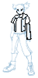 The nice part about using a background drawing is that it reduces the amount of thinking you have to do, which makes things go faster. You can just follow the general guide of the background lines and fix up parts that don't look right. Always remember, however, that the background image is just for reference. If something doesn't look right, fix it when you're retracing. Usually the faces will come out looking like random pixels on the background image so you have to make it up when you're retracing. You might even change a large chunk of the pose (like I will with the foot I don't like) because it just doesn't look right in pixel form. Do what looks best on the sprite. Also, try to avoid blobs of pixels...Like in her arm, I just quickly drew it without letting go of the mouse button. Note the blobs of black pixels at all the corners and a few stray pixels...REALLY try to clean this stuff up. If you have a group of 4 black pixels it makes a really visually distracting point in the sprite. You might even have to alter the pose slightly to get rid of them...like if you have an arm beside a leg and the two outlines are right beside eachother so where they touch you get a line of black pixels 2 pixels wide, move the arm or move the leg so that you only have a line one pixel thick there. Sometimes you just CAN'T avoid blobs, but most of the time they can be fixed up. Moving on now:
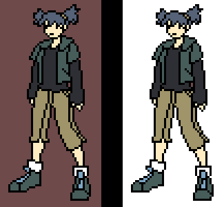
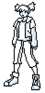 Here I've finished retracing the lines with black. There are details that I'll add when I color, and the face is a little difficult to make out (specifically the eyes), but they'll look better when color is added (and you can see the white of the eye...it'll register as "oh, okay, so the black pixel to the left of the white one is the eyeball" mentally). So let's start out with flat colors first:
Here I've filled in the flat colors...I work with a bland colored background instead of white because it's easier to see the colors I'm using. If you look at the one with a white background, the colors look darker (especially her shirt) because the white is so bright in comparison. It's a trick your eyes play on you. By using a darker color in the background, you can see what the colors actually look like. So let's move on to adding shading:
 I like to start by shading the skin first...There's no real reason for it, so start where you want. The face is the trickiest part of doing a sprite because the expression has to be readable and you only have a few pixels to work with. I used a slightly darker shade of skin color (darker than the general dark shade) for the mouth and nose. Using black for them makes them stick out a little too much (black for a mouth makes it look like the mouth is open), and using the normal dark shade makes them a little too light to be noticable. Now that there's white pixels for the eyeballs, you can see that she's looking to the side. So moving on, I shade the rest of her:
Now she's looking a little more 3d with the shading. But she's not done yet...I want to add some details like trim on her shirt and lines on her sleeve, which like I said before, I do at the pixel stage, where I can see how much room I have to work with. So here I add all the details and get this:
 Originally I planned to have two white lines going down her sleeve, but there just wasn't the room on this sprite to do it. There would be too much white and it might look like black lines on a white sleeve instead, or just too much of a blob of colors. The white, being pure white which is bright, contrasts a lot with the darkness of her shirt, so the white sort of glows. It almost looks like the white line is more than one pixel thick, but it's not. It's the contrast that fools the eye (like I mentioned before, about using a dark colored background instead of white when adding color to the sprite). I could have toned it down a bit, but it works as it is so it's not a big deal. If I was dead set on having two lines on the sleeve, I could simply show the second line when she has her side turned to the camera more so it's like the other line is around the bend of her sleeve where the viewer can't see it right now. I gave her shoes some lining, as well as her jacket, and changed the black lines on her pants to just dark shaded lines for the same general reasons that I made the mouth/nose a shade instead of black. Black stands out a little too much. The last thing you might want to do is make the outlines colored:
 Personally I don't like the colored outlines. Capcom uses them and when they use them, they look great, heh...I haven't quite figured out the trick to it (though I'm pretty sure you just need to use much much darker colors for the outlines) and I like the look of the black lines. With the colored lines, everything gets kind of blurred out and there isn't as much definition in what pieces of clothing start where and everything. Plus if your background is red and all your red clothing is outlined in red, it'll look a little odd. With black the only real problem is when your sprite goes over a black area, and it's easier to avoid than a bunch of different colors. But again, this is just a personal preference and I don't quite know the technique for getting colored outlines to look nice yet. Like I've said a bunch of times now, do what looks best for the sprite.
Contents:
Author of this page had got the permission to host this tutorial here. To have this tutorial at your page you must seek permission from its author.
|