| |
DRAWING FROM A REFERENCE PHOTO
Author: Philip H. Williams
|
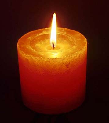
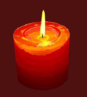
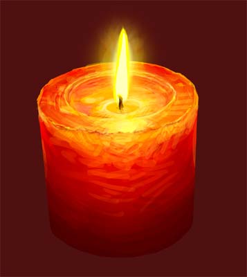
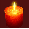
The original photo: I locate it on the bottom layer to use for some initial tracing, primarily to save time and get the perspective correct. Some people prefer not to trace. My feeling is - been there done that - so I have no problem saving a bit of time by using a simple tracing technique. In Photoshop I set the image size to a height of 4000 pixels and let the width fall where it may. That creates an image size that I like to work with.
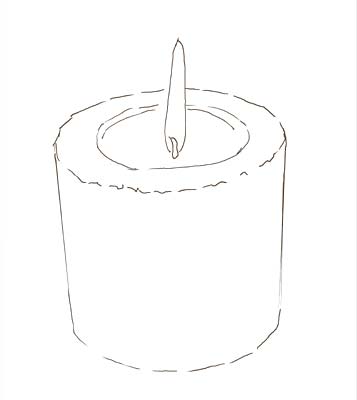
The Tracing: First step is to create an "onion skin" by adding a white layer above the bottom reference photo layer and setting its layer opacity down a bit so that the image can be seen through the white layer. Next I create a blank layer above the white "onion skin" layer to use for tracing the position and outline of the candle. It is important to make the tracing on a separate layer and NOT on the onion skin layer. This is not meant to be a detailed drawing in any sense... just a rough sketch showing where the major color areas and important perspective and detail elements are located.
Once the rough sketch is completed, I return the opacity of the onion skin layer to 100%. By this time, I've also printed out a good quality print of the reference photo to "eyeball" for building up the picture's color and definition. From this point on, I don't use the bottom layer anymore, just the reference print out. You might ask, why not use the bottom layer to pinpoint color differentiation in the different areas. It would certainly be easy enough to do... yep, it would, but it would also give the reference photo much more influence than I'm comfortable with it having. I'd much rather use my own drawing skills to muck things up a bit, change things arond, modify things, add my own personal spin to the developing picture. It is never my intention to reproduce a photograph. Rather I really do like to use the photo as a reference to build an image that is hopefully unique and interesting.
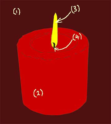
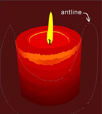
So let's begin. For the candle, I create four more layers for the dark red background color (1), the bright red candle (2), the flame (3), and the wick (4). Yep, that little wick gets its own layer. The lasso tool: To fill in the color, using the sketch lines as a guide, I use the lasso tool to define and fill the major areas of color on each layer. The lasso tool is, in fact, about the most important tool I use throughout the development of the image to define areas to manipulate, to change or modify, to do whatever. The lasso tool is my drawing tool supreme. I draw with the lasso tool... I define with the lasso tool... I do just about everything with the lasso tool... hope I've made my point... I love the lasso tool... :)
Of course the lasso tool is nothing by itself... it has to be used in conjunction with adjustment and fill tools like levels, color balance, contrast, and hue/saturation, I have a number of actions set up to help with these combinations. For example, after I've selected an area to manipulate (using the lasso tool to select an area which is then defined by the "antline"), I have an action assigned to my F2 key. When I press that key, the levels dialog box pops up. After I've made levels changes and hit the OK, the action next brings up the color balance dialog box so that I can make color adjustments if needed. Sure does save a lot of time, those Photoshop actions.
Using my eyeballs on the reference photo, I continue to lasso areas of the candle and make appropriate changes in level, color and hue/saturation. For this image I didn't use the contrast adjustment. Much of the time my lassoing overlaps previously lassoed areas with varying results. I don't worry too much about perfection at this stage, because I know that in the next stage - working with the pencil tool - I'll be able to work out any color and visual problems.
The Pencil Tool: Now the image is starting to come together. I begin using the pencil tool at varying pixel widths. I rarely if ever use the brush or air-brush tool, mainly just the pencil tool. Because the size of the image is quite large (at least 4000 pixels high), the pencil tool works well without having to worry about the jaggies - those jagged looking edges. I generally have the size and preasure set to "stylus" and the opacity set to either 33% or 66%, never 100%. I mostly use it on normal mode, but sometimes will use multiply mode to work up a particular darkening. My palette is pretty much developed from the existing colors on the image, which are quite varied by this time because of all the lassoed adjustments previously made. With Photoshop, it is just a matter of holding down the ALT key (Windows version) in the pencil mode to pick up the color under the current position of the pencil... so, smoothing out those hard color changes between areas of color is a cinch when the pencil tool's opacity is set to around 33%.
Getting Reckless and Spontaneous: One of the tricks that I use quite liberally at this point is to work with the pencil tool on a new layer just above the layer that I intend to add color or drawing to. In that way I can be quite reckless and spontaneous without worrying about really screwing up. If it works, I merge the layer... if not, I delete it and start again. It's quite remarkable how this trick helps push the envelope to the point where I find myself using it less and less because my successful spontaneous work seems to be working. It's a bit like a trapeze artist on a safety wire while working out a new move. When the move is finally comfortable, the safety wire is no longer needed.
After doing a bit of work on the flame and wick layers, I add another layer just below the flame layer. That layer is for the flame glow and is highly feathered and set to a layer opacity of about 50%. And finally, after a tweak here and there, it's done... Hope the tutorial has been helpful...
|
|
|