|
Foreword
When I mention rules and art in the same sentence I often get a knee-jerk reaction from people. Many people say that there are no rules in art. Maybe I got my own definition for the word, but I really think that there are rules and logic behind why a picture looks good or not.
Since I think there are definable rules, I also think that it's possible to build an art AI. I don't think there's anything 'spiritual' about art which only allows human to do it. I can't make any predictions about future AI, but currently we're nowhere near it. The development of AI (into I?) can progress very rapidly and end with a technological singularity, but that's another story.
Now, this tutorial is an attempt to break out and isolate the rules I consider every time I make art. It's important to note that my rules are very generic, not very consistent, and maybe even erratic. I've pretty much figured the stuff out myself so take it with a grain of salt.
The far most useful critique I can give developing artist is: practice. Make studies of everything with every media. Yes, that also means drawing stuff you hate. So what is this tutorial for if you all you need is practice? Well, I think there are a few things that it helps to know early on, but you won't see any improvement from just having read the tutorial. It will no doubt take you a while to digest everything I've written here, so you might need to come back to the text with a few months separation.
Terminology
I'll try to stay away from complicated words. Here's a few basic ones.
- Hue - Variations in color. Skin has hue variation, such as cheeks being rosy.
- Saturation - How much color there is. Neon colors are very saturated.
- Value - Brightness/darkness, as if it was greyscale.
- Read - You can see what it is.
- Radiosity, ambience - reflected light - When light is reflected of a surface and then hits something else. In a green room everything will get a green hue for example. Radiosity is a 3D rendering term for the whole phenomenon. I use reflected light for sources I can trace, and ambience when the light has bounced around an entire scene mixing with everything.
- Speculars - Dots of light that appear on glossy surfaces. Light generally is broken up by small bumps in surfaces, so it doesn't matter much where you stand, the surface will look almost the same from different directions.
- Flatten - Removing unnecessary texture and values.
- Form - The 3D shape of something.
Seeing
The aware part of the brain can't handle too much information, so it's more efficient to develop reflexes for the most common and repetitive tasks. There's a part of out brain that processes the image from the eye. After processing it actually sends very little information to our awareness. Unfortunately for artists it also tweaks our perception of the image. Here's a few examples of what I believe the process does:
- Unwrap. We 'see' surfaces from the front, or several sides at the same time. The side of a box doesn't look skewed to us for example.
- Brightness and white balance. A leaf in the shadow looks like it has the same color as one in the light.
- Distance scaling. A person far away still looks human sized.
I heard a story about a man who had grown up in a dense jungle, and thus never had seen anything at a distance. A scientist took him out on the savannah where a rhino was grazing on the horizon. The man thought it was an insect. As they came closer, the man thought the 'insect' was growing.
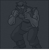
The onion (thinking in layers)
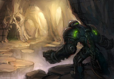
Before laying down a stroke, there's a number of things you need to think about. Well, actually you shouldn't have to think about them, it should just go automatically.
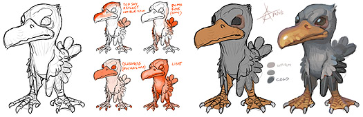 (click to enlarge)
- Feel volume and angle of the form.
- Where is the light coming from?
- Try to figure out if there are any shadows that might be falling on the surface.
- Is there any reflected light (radiosity) that hits the surface?
- What is the ambient color of the scene? (sorta like global reflected light.)
- Any speculars. Is the surface gloss/wet and also angled so it reflects a light source, such as the sky?
- The exposure level. Perhaps it's so heavily lit that it becomes more than white? Perhaps it's so dark that even the brightest spot is hidden in darkness.
- Is there any fog in the way?
- The texture of the surface.
Note that this mainly goes for realistic styles. A brushstroke should also look efficient and consistent with the rest of the painting and your color scheme choice. You might also have an idea or style which disallows certain colors or textures and put priority on other things. However, even in a Powerpuff Girls illustration there's simplified elements of realistic rendering. Don't hide behind "it's not apart of my style so I'm not gonna learn it".
Let there be light. Speculars
There's really just one kind of light. It bounces. You can only see the light (photon) if it enters your eye. Light does two important things when it hits a surface. First, a part of it is absorbed. This is how colors are made. A red apple reflects mostly red wavelengths, the rest are absorbed and turned into heat or something. That's why black stuff get so hot in the sun. Anyways, the reflected light bounce away differently depending on the surface. If the surface is bumpy it will bounce away sort of randomly, like a tennis ball that hits rocky terrain. If the surface is smooth it will bounce away in a predictable path. A mirror is very smooth so the light comes back undistorted, so we can see our reflection.
Note that all surfaces have speculars, because speculars is just reflected light. It's just more broken up/diluted on dull surfaces.
Depending on where the eye/beholder is, it'll see different light and different specular spots on a curved surface such as this. A puddle isn't curved (other than the edges because of surface tension) so you'll only get a shiny reflection from a certain point of view. Point speculars can only appear in an environment where there's a point light source, like a sun, lightbulb or small window.
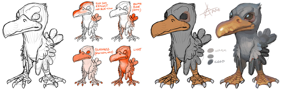
Photo - speculars do exist on cloth, diluted and subtle. I stretched out my shirt sleeve with two fingers to get a flat surface between the two marked dots (I moved the camera and not the sleeve).
Radiosity, reflected and ambient light
Here on earth we have lots of stuff around us that the light can bounce off, so things here are more or less lit from all angles. For example we have the sky which is like a dome shaped blue light source. Then theres the ground, walls and other surfaces. In space there's basically just one ligh source, the sun. This is why the moon just has a lit and shadowed side, and looks kind of flat. If you looks carefully however, you can see earthlight on the shadow side of the moon, but it's very weak. Then there's starlight, which I guess is even weaker.
When light hits a surface and bounces, it also change color. If it hits another surface of the same color it bounced off, it will make that surface look even more saturated.
Exposure
The sunlight is much stronger than the skylight, which is in turn much stronger than indoor light. Our eyes adapt automatically after a while, and we can also adapt by squinting or just focusing on an object. Because we do this without thinking about it, it's hard to understand that our eyes are actually kind of limited. This limitation becomes even more obvious with cameras. If you take a picture indoors, the windows will become overexposed (bright). You might try to adjust the exposure levels to the window light, but then the indoor environment will become underexposed. This can be used to your advantage. By for example putting a character or object in the foreground where it's darker, you can make the silhouette read well against a well lit room.
The exposure to light can also make parts of a body look very bright or dark, not skin tone color at all. When the shadow is dark and the lit side is overexposed, the only place for the color to go is on the edge between them.
Materials
Here's an example of various materials and how i render them.
- Cloth - Hardly any speculars, just shadow and light. Sometimes strong light can penetrate thin cloth and cause some sort of subsurface scattering.
- Leather - Can be a little gloss and thus have a few speculars. Also, don't make it too saturated.
- Trees and wood - Dull. Not very saturated either (sort of grey-brown-sienna).
- Stone - A bit like cloth. The surface is often to rugged (both at micro and macro levels) to have any serious speculars.
- Plastic - It seems like the speculars and reflections are colorized in the color of the plastic. Plastic can also be a bit transparent.
- Gold - Gold isn't orange. I use black - desaturated orange sometims with hints of green, then up to yellow and white.
- Silver - More or less like a mirror.
- Metal - In the case of armours I often push the values a little more, not as much midtones.
- Brushed metal - It's sort of like an inbetween of a grey surface and a silver surface.
- Glass - Often just transparent with distortion. The speculars come suddenly and are often white. In the case of car windows you might have noticed that it's easier ot see what's behind if there's a shadow over the window. The brighter reflections obscure.
- Wet stuff - more speculars, can become transparent in the case of cloth, and stones get more saturated and pronounced details.

Shadows
Shadows are quite flat and generally less saturated than the lit side. It's easier to notice ambient light in the shadows. Shadows get blury over distance, this is called diffraction.
(Shadows don't add with just ONE lightsource that is...)
Skin tones. Consider the environment
The light is stronger outside, and the skin color tend to be less saturated due to the sky blue ambient light and sky blue speculars. Sometimes the skin color become shifted towards purple because of the sky blue being mixed in. This is especially true if the subject is standing in a shadow.
Indoors (no windows, only light bulbs) the light is warmer and allows skin saturation to be amped up to oranges and reds.
The shadow color of the skin can sometimes wander off to greens, especially if the room have green components, like wallpaper, plants, furniture.
In a white room or a bathroom the skin tones would be quite pale, closer to local colors and less contrasted (shadow/light) due to lots of ambience.
A room with a single strong light source will probably result in near black shadows.
...so, the type of environment your character is placed in very much affects how you should render it.
Hues
The human body has a lot of different hues. Parts covered by cloth gets less tan. Mons pubis, the hip bone area and the chest is quite pale. The shoulders and lower arms gets a little extra tan. The inside of the lower arm is often pale however. The kneecaps and elbows have a little darker skin. The face also has a lot of hues, such as rosy cheeks, males might have grey or almost green jaws because of stubble. The best way to learn the hues of the human body is to make studies of course. Don't forget that animals, monsters and objects also have hues. If you paint everything with the same hue and saturation it will look boring. Some hues are due to ambient and reflected light. The shoulders and surfaces pointing up can get a blue hue because of the sky reflecting.
The gradients between the shadow and light is not just an in-between color of the shadow color and light color. If the shadow and light is just blended, it will look very lifeless. If you look at pictures you will see that the gradients is saturated. It's especially easy to notice if you remove that saturation.
Strong light can penetrate the surface of some materials and bounce around, then exit again. This will increase the saturation and make the surface look illuminated from the inside. In the case with human skin, we sometimes see it on hard edges between light and shadow.
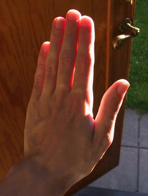
Photo - Leafs are gloss on the top side which means there can sometimes be a sky blue specular here. The light shining thru the leaf makes the bottom side more saturated, this is also true for ears and fingers, which can turn super red when heavily backlit.
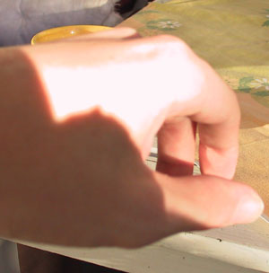
Photo - Sub-surface scattering on the fingertips. The light on the left side of the thumb is probably light reflected off the index finger.
Photo - Note that the edge only appear if the light is overexposed. It does not as pronounced on the thumb.
Relativity
Colors and values are relative. By using various tricks it's possible to trick the viewer into thinking a color is really another color, or a value is darker than it is. Unfortunately, the artist is also tricked into using too much colors or values than is needed.
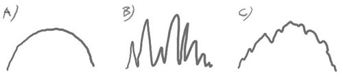
A hard edge between two values will be much more obvious than a soft one. You'll have to know when to use which. Sometimes your choice of values is very limited, such as when you're working in the shadow. By using hard edges you can describe a lot more detail with less values available. However, using gradients is very useful for changing value without the viewer noticing. The 'fake flat' illustration looks flat, but is actually a gradient. The square is the same color as the left side of the 'flat' rectangle.
Colors with the same value are relative in terms of hue instead. A common mistake is to draw one detail too saturated, then something else nearby looks grey, so to compensate you increase saturation on that detail too, and as a result the whole painting end up too saturated.
Color identity
It's easy to get carried away and go over the top with highlights. This makes it hard to see what color the subject is. Instead you should use shadows to describe the volume of the subject.
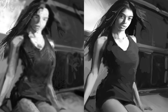
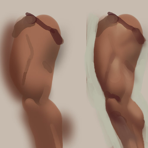
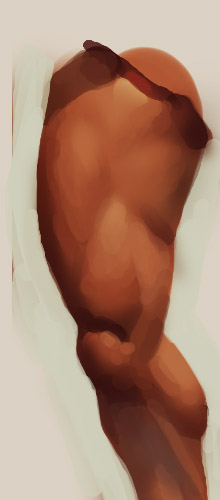
Flatten and simplify
Work with larger brushes and remove unnecessary brushstrokes. See the bad and better example below. I really didn't do much on the second one. It's actually simplified. It's surprising how much a little flattening here and there can do. I did spend some extra time on the face though. A bad face can ruin everything.
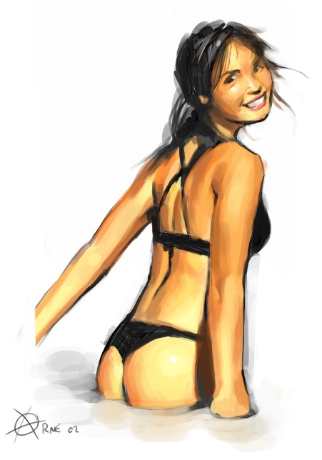
Focus points
A painting is a hierarchy of important and less important details. If you're doing a pin-up the main figure and silhouette is the most important. In comics they often use a fat outline around the silhouette, whilst the less and less important details get thinner and thinner lines. When painting you do the same thing, but with brushstrokes instead! You use differences in hue, saturation, value, edges, sharpness, detail and composition to lead the viewer's eye towards the focus point of the painting.
If you use the same rendering everywhere on the painting it will look flat. You can lead the eye toward important spots, but once the eye is there it needs something interesting to keep it there, like proper details. The amount of details on a spot should be proportional to the amount of time the eye stays there.
Attempt to isolate some of the techniques you can use to attract the eye.
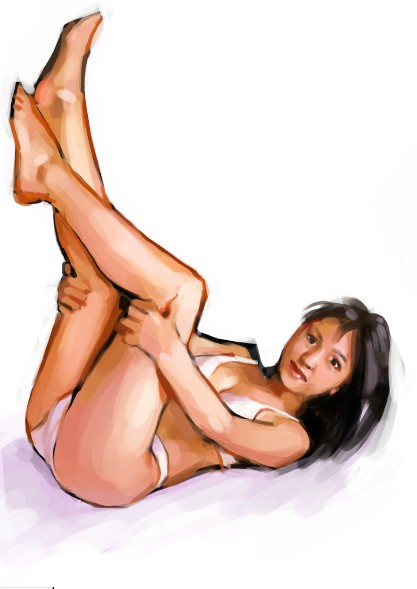
Here's an example I made: (a) Important forms, (b) texture, (с) both
It can be very dangerous to get excited about rendering details, especially at an early stage. You can not render details the same way in the shadow as in the light. On the second one (B) I just rendered all the details to demonstrate how it can look if you just scribble down all the detail without thinking about the important forms (A). (C) is still a bit confusing but that's more of a construction issue. Side views can only get you so far, and the anatomy is pretty odd which makes it harder to read.
A is the form without detail, B is the detail and C is both. Be careful not to do too much B, the form has to read!
Perspective and construction
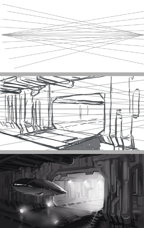
I'm not going to have a long perspective tutorial here. Instead I'm just going to mention how much easier it gets if you make a few guide lines to align the figure/environment after as you draw.
If you're reluctant to do environments just because perspective is tedious to set up, you can use a simple 2 point perspective and just guess in the details. It's surprising how much easier it is to align things correctly with a few guide lines (for me anyways). It doesn't have to be perfect to appear correct. There's a risk that your designs will suffer if you can't improvise quickly and have to consult the ruler every other stroke. First draw a horizon line, then radiate lines from both ends in a random manner, then just crop and sketch away.
Here's a few quick freehand lines helping me to align the shoulders and stuff. When drawing people, it can help to align stuff after a 'spine'.
Line art
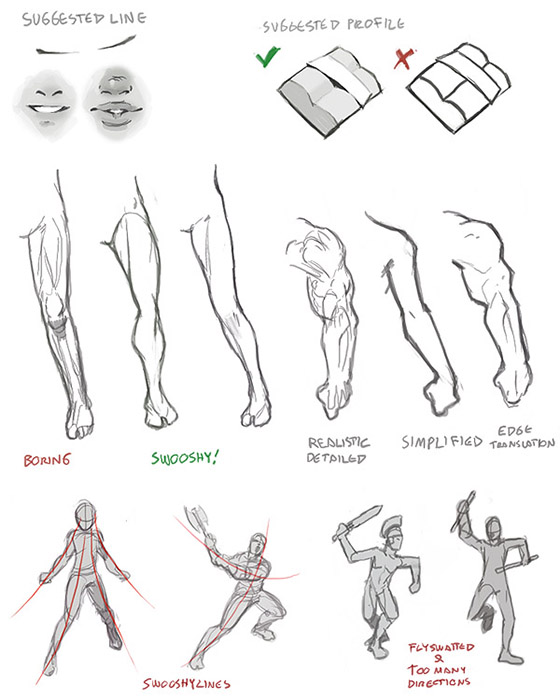
Exaggerate. One great thing about art is that you can exaggerate things, like hips and boobs. Haha, no, actually I'm serious. It's a good thing if important curves are more pronounced.
Simplify. The advantage art holds over photos is simplification. In a photo you'll get distracting details. When drawing, you can remove objects that aren't relevant to the scene. Wrinkles and minor protrusions can be removed to get a better line flow. A common mistake I see is when someone has drawn all the abs (belly muscles) with an overly amount of crosshatching. It's better to leave out lines, especially if you're going to color, because then the contrast between different color fields can work as lines.
Harmonize. Another word for this is 'swooshyness'. Unlike the above things it has to do with the relation between details and how lines intersect and take over ofter another. Try having a few swooshy lines that you align several parts after.
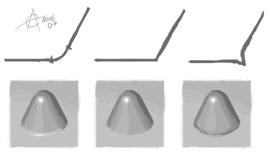
Stylize. When going for a style it's important to be consistent. You can turn curves into hard edges, or you can go for sweeping sinus lines. I prefer a combo where I turn a curve into a hard edge at a certain threshold.
Line weight. I'm not a big fan of fixed line width, so I devised some general rules for varying line width.
- Lines are thicker on the shadowed side, thinner on the lit side.
- Lines are thicker near the viewer, thinner further away.
- Silhouette lines are thicker. Inner details get thinner lines.
- Lighter materials get thinner lines.
- Thin lines works good with detailed motifs.
- Thicker lines work well with simple figures.
- Fat line art works well with flat colors (cel).
- Thin line art works good with realistic rendering and pronounced volumes.
Also, you do not always need to draw a line. Sometimes it you can just hint the ends of it, and the eye will fill the rest in. Examples are places where skin is pushed together, like the mouth, buttocks, pushup boobs etc. It's good to make the line a little thicker where there's a gap. Examples are places where clothing stretch over gaps between muscles or... cleavages.
Finally, here are a few illustrations. The first one is Photoshop (5.5) + Wacom tablet and there is no line quality to speak of, but I hope you get the idea. Second one is an inked thing from a few years ago.
When painting, subractive edges which are remnants from the line art or construction stage can be harmful. You can separate shapes with other means than black lines, such as different value, or a bright line. Here's an illustration of a few possible solutions and what they convey.
A line art image might go several stages of refinenement where previous, rougher stages, are constantly faded and painted over. Final stage not completed here.
Studies. How?
I didn't start making studies until just some years ago, and that I regret. You won't stumble upon the right lines with guesses and wild scribbling. Using reference will only get you so far. In order to be loose and fast you need to be able to draw without having to think about the general construction of things (such as basic anatomy). This way you can concentrate on the actual design and detailing.
Construct your drawings/paintings. Don't march around with the pen doing detail by detail. Always check the general proportions and don't get caught by details too early. Place marks where the important features are. These well be like landmarks you align after.
Try to learn one thing at a time. You can't learn juggling while also practicing 400m hurdles. If you want to learn how to handle the medium/tool, try making studies of easy stuff like fruits. If you want to learn human faces, use a medium you know so you won't have to struggle with that as well. If there's several things you can't handle then you won't see what it is you're doing wrong. Quantity is also important. I wouldn't recommend making anatomy studies with tedious woodcarving tools for example.
Pencil
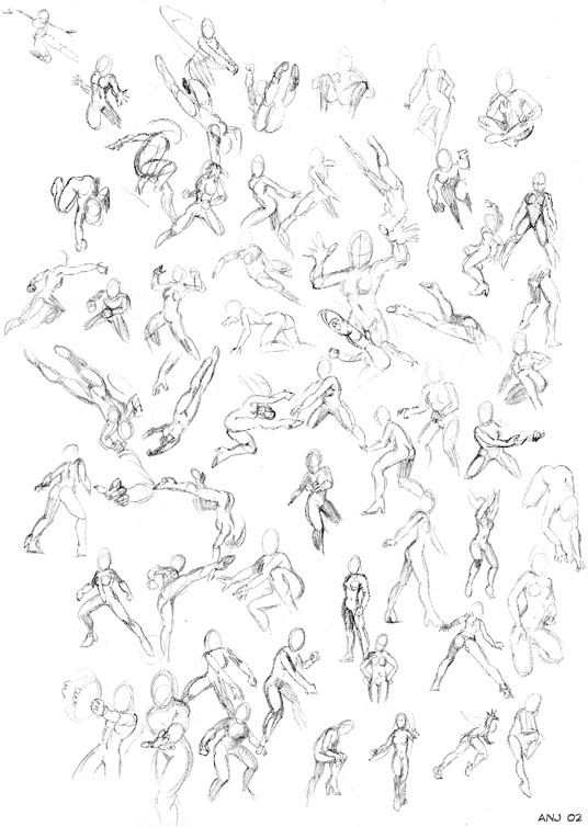
Pencil studies doesn't have to be more than a few quick pencil thumbnails on a paper. I spend a few hours on studies when I do them, and I put about 10-30 on each sheet (A4). I only do a couple of studies a month, but I certainly notice improvement each time. Just imagine what would happen if you did them several times a week for years.
Примеры - 1, 2 - несколько старых набросков с комиксов (позы) и фотографий (лица).
Paint
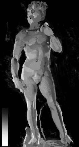
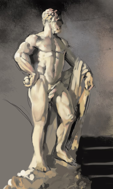
When I do digital studies I use Photoshop and mostly a picture from the net. I duplicate the window and clear the new one. Then I start placing the larger color masses on their approximate positions. After that I gradually increase the details and value/color accuracy as good as I can. When it looks close to the original, at a distance or with the eyes squinted, it's finished. I always work with the largest possible brush allowed to render a given detail. I don't color pick from the original, but I do keep the windows in the same size so I can see if I misplace anything. If you want to increase the difficulty (and reward) you can always try to draw in in a window with different size, and mirrored, or paint something from still life.
Examples - 1, 2 - First one is Open Canvas, second is Photoshop. 3a, 3b, 4 - Here I tried to be as economical as possible. Second one isn't a study but an example of a cleanup, which isn't necessary for studies. 5, 6 - These are made from reference. I took the liberty to add some line art and style. Opencanvas. WPE. 7 - One of my first studies.
Study subjects. Study what?
Study everything! You need to build a large library of shapes and things in your head to be able to draw intuitively. This takes about a lifetime or more to do, so you better start now!
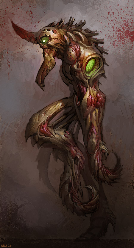
Human anatomy. One of the most important things you need to know. Even monsters have traces of human anatomy.
- The whole body. Use photos, anatomy books, statues or real people.
- The face is the thing we look at first. If you misplace a line just a bit the whole expression of the face will change. Make studies of photos, your friends or yourself.
- The hands are also important (and hard) to learn.
- The feet can be tricky too, not because of the shapes, but because you need to plant the character on the ground so it doesn't look like it's falling over or the ground is leaning.
- Daily clothing. It's important to learn how cloth wrinkles, how different types of cloth looks and fits.
Gestures & styles. You need to be diverse and get fresh ideas. Learning some different styles can be a good idea.
- Draw from life using your friends or people at a cafe, a bus or somewhere. How does a person pose when he opens a door, reaches for his keys, and looks intimidated by an artist?
- Marvel. How does the Marvel artists represent the human body with lines? What details are important and what is simplified?
- Modesty Blaise, or some fairly realistic comic style. Drawing gradients with just blacks and whites isn't easy.
- Manga or a style you like. Again, how does the artist convert the human anatomy into lines and color blobs? What parallels can you draw between the different styles?
Environments. Putting your character in an environment really brings it alive. This is something I definitely need to learn myself.
- Landscapes with fields, mountains or whatever.
- A dense forest or a jungle.
- An urban or industrial 'landscape'.
- An indoor setting, like a room with furniture. Boring, I know. To be honest I haven't done this yet.
Fetch an animal book...
..and draw some animals. A good way to design a monster is to morph different animals into one.
- All living things. Mother nature have spent millions of years perfecting the designs, so you better study them.
- Horses, Cats, Dogs, birds. These are especially important since they are more commonly seen.
Machinery. You also need to practice drawing machinery. It can be useful when designing robots and planet-smashing vengeance-crazed battle droids.
- Cars of different models.
- Digging and working machinery.
- Military vehicles.
Classical still life objects. Or basically anything. Good for learning how to draw and paint in general, because of the simple shapes. You won't have too struggle much the shapes and can concentrate more on the materials.
- Flowers, fruit, skeletons, sculpts, chunks of wood, rusty metal parts.
Selfcritique
Analyse what you're doing wrong. It's easy to get blind from staring at the image too much (which you must do to be able to work of course). Try flipping the images, look at it upside down, through a mirror (I use a CD), and zoom in and out (or back away). Don't sit and nibble too close to the paper or zoomed in. You can also make a 'New view' (Photoshop).
You must also accept that just because you have worked on something for a while doesn't mean it's worth anything. You must be ready to sacrifice the time you spent on something if it looks wonky. Even if you're happy with the detail you might have to rework it (Kill your darling). Sometimes it's not the the detail you're concentrating on that's wrong, but something relative too it, like the value of the background or the perspective of another detail.
What's the most important in a painting?
1. Construction. What are you trying to paint? Your subject and composition should work on a fundamental level. If not, then no rendering in the world can save it. Don't have any illusions that you will be able to salvage the piece later. If a pose look wrong now, it will look stiff when finished too, even if Rembrandt himself painted it.
2. Values. For a painting to work you need to use values to sculpt the forms. Values can do a lot of work grouping and separating shapes. Example 1 - The first version here is obviously wrong. Each shape has just gotten the shadow and highlight treatment. Second one is better but there's just one value type. Third one has different values on different shapes. Maybe it fails at the construction step though; it's not a very interesting pinup. Example 2 - Here both value and color is used to separate the foreground and background, although I don't like this painting either, again it fails at construction.
3. Color. You can be a little off with the colors (hue and saturation) and still get away with it. If you just can't make the colors work, it is probably the values that are wrong. On a side note, if the previous steps do work, it's easy to make fresh looking images with color balance tools. In my experience the original choice is often the best.
Critique and common mistakes
When I give critique on various forums I often end up typing the exact same things every time. Here's a list of the common mistakes beginner artists make.
Problem: To go shadow - midtone - highlight on all shapes, regardless of location and angle of the shape.
Solution: Try to zoom out, flip it, turn your head upside down. Don't render each detail individually one at a time. Equally lit minor shapes flattens the painting and makes it hard to make out the important major shapes.
Problem: To mix black into the shadow and white into the light, and then smudge the in-between colors.
Solution: This makes the painting look grey and dull. I've encountered a few people asking for 'shading tutorials'. There's no such thing. There's no shortcut saying you should start with a dark color222 and end with a bright color, then do that on every detail. You must learn how light works and almost render as if you were a 3D computer program. Some might knee-jerk about that, but for me it's true, I often get the best result when I let go of my bias and habits and just follow the 'render rules'.
Problem: To render and highlight details that will only distract the viewer. Dodge brush is real a sinner here.
Solution: You will have to sacrifice a lot of details that could have looked awesome fully rendered. What's important is the wholeness of the painting. So, no flares on the belt buckle on the unimportant little guy in the corner. The eye homes in on, contrast and saturation. You should lead the eye to the important parts of the painting.
Problem: Flat and stiff poses, figures look fly-swatted.
Solution: I do this a lot. It's so easy to draw people from the side or front with arms stretching out. This will end up looking very boring and undynamic, unless you have a compositional idea, or you're doing an icon. It's tempting to try to show all the details of a character in one drawing, but if you're going for a dynamic pose that is rarely possible. Letting the body obscure an arm might be sacrifice you have to make in order to get a good pose. Also, when hiding a detail, you'll let the viewer's imagination decide how it looks, which can be a good thing! It can look better in the mind than it ever could on canvas.
Anyways, Learn foreshortening and dynamic poses from doing studies of comics and real life models or photos. Fly-swatted characters will only get you so far.
Problem: Bad stroke economy, or attempt at artsy 'ooh, lookit I'm so spontaneous'-strokes.
Solution: Each stroke should be contributing to the piece. Some hope to get away with random artsy strokes. Random strokes makes random details. Random details distracts the viewer from the actual details of the painting or drawing. I know it seems like some artists paints a perfect scene with just a few swift well placed strokes, but I think they actually do a lot of cleaning up and optimising. Go over the entire painting piece by piece and remove/flatten strokes that aren't contributing. Make sure the motif gets the focus and not some artsy stroke. The major shapes and volumes are always the most important and many neat strokes will have to be sacrificed in order to make the whole thing work.
|


